
KomeNO
Simplifying ingredient lists
Type:
Medium:
Timeline
As someone with acne prone skin I have to be very careful with the skincare items I use. Certain ingredients will irritate my skin, clog pores, and cause me to breakout. I noticed that the way to check for those ingredients is so time consuming that I sometimes skip it. In order to fix that I wanted to create a an app that makes the process as seamless and simple as possible.
Research
What causes clogged pores?
Clogged pores are caused by a buildup of dead skin cells, oil, and dirt. Certain ingredients cause more build up than others and over time clog pores causing inflammation which results in acne.
My current process
What I currently do if I want to check a product is I search for the product and copy and paste the ingredient list. I paste it into a few different websites to learn more about the ingredient. While this isn’t a terribly time consuming way of checking, it could be faster. When you are standing in a shop trying to figure out the ingredients you might not have the time to search the product and copy and paste.

Competitors
There are a few different apps that help analyze ingredients. Something that I don’t particularly like about some of them is the way they make it seem like there are “good” and “bad” ingredients. In reality you need to have a nuanced view of ingredient lists and there are no good or bad ingredients. They work together and don’t act on their own in isolation. This way of looking at ingredient lists is based on outdated science. With my app I want to display information in a neutral and non fear mongering way.

Branding
One of the ways I plan to achieve this neutral way of conveying information is through a calm and peaceful color palette. In addition to that I want the whole UI to be minimalist and to the point.


For the brand guidelines I knew I wanted to pick neutral colors that conveyed calm and peacefulness. I had the same idea while thinking about the typefac and wanted it to feel very clean.
Design Process
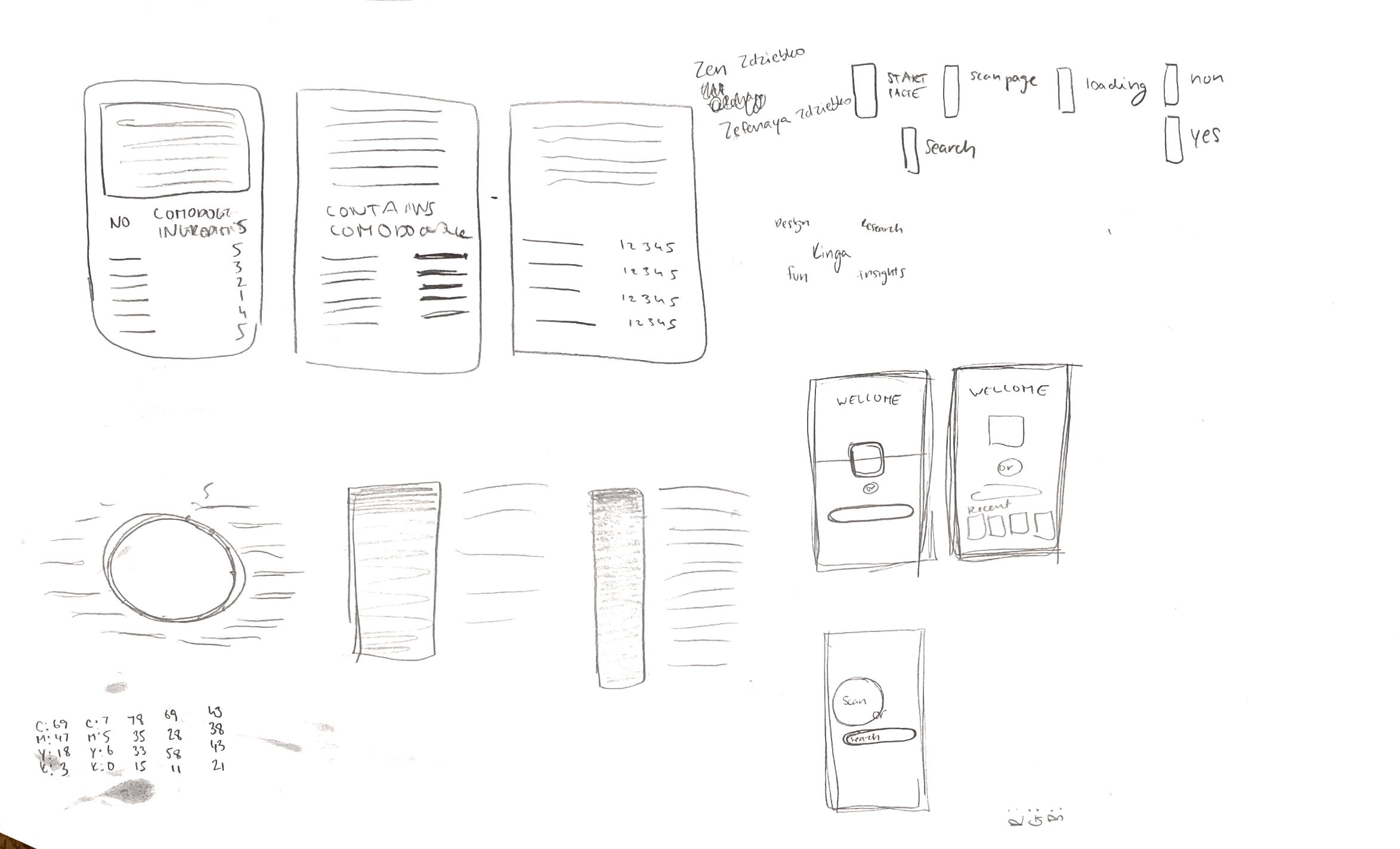
Sketches
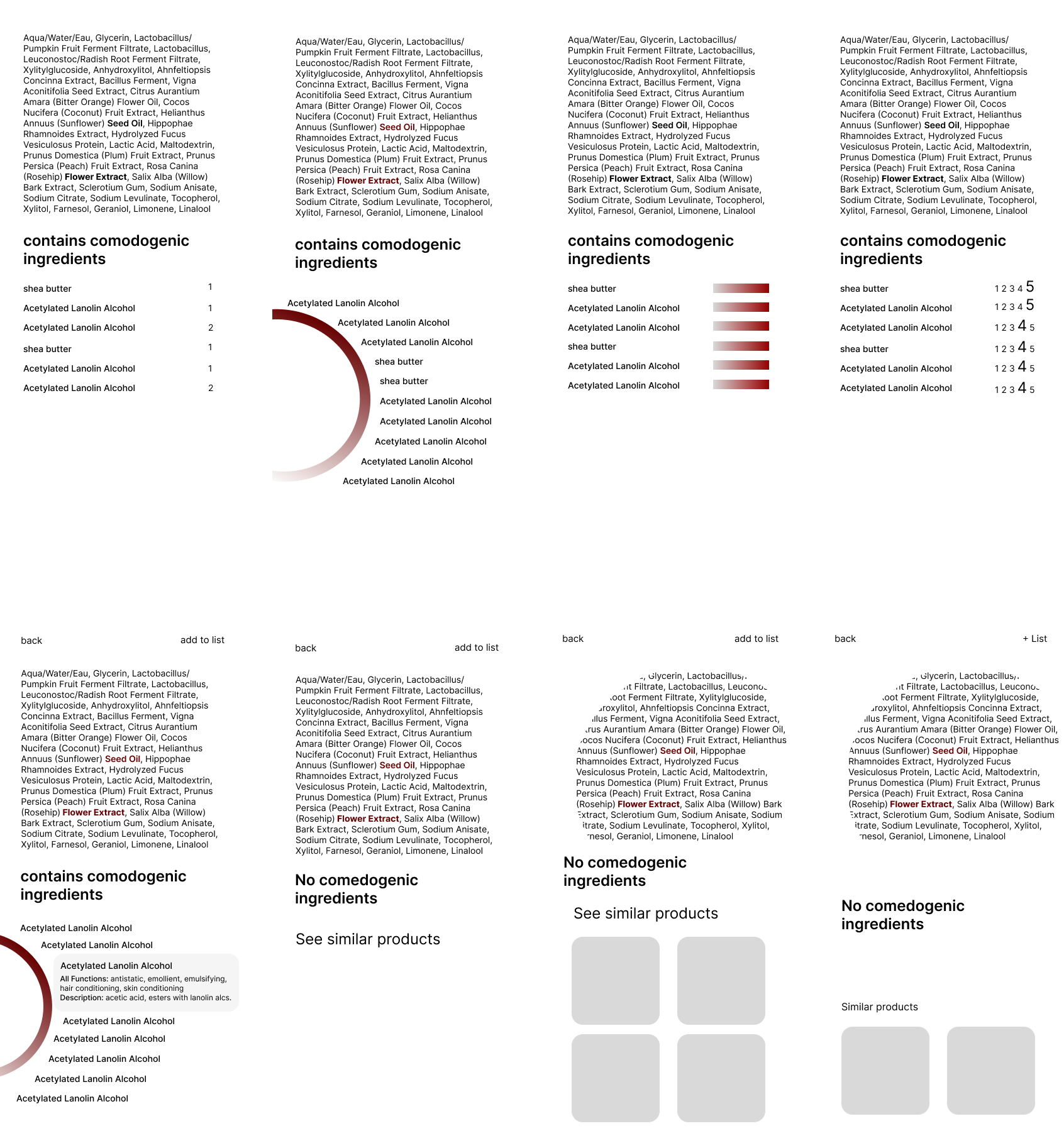
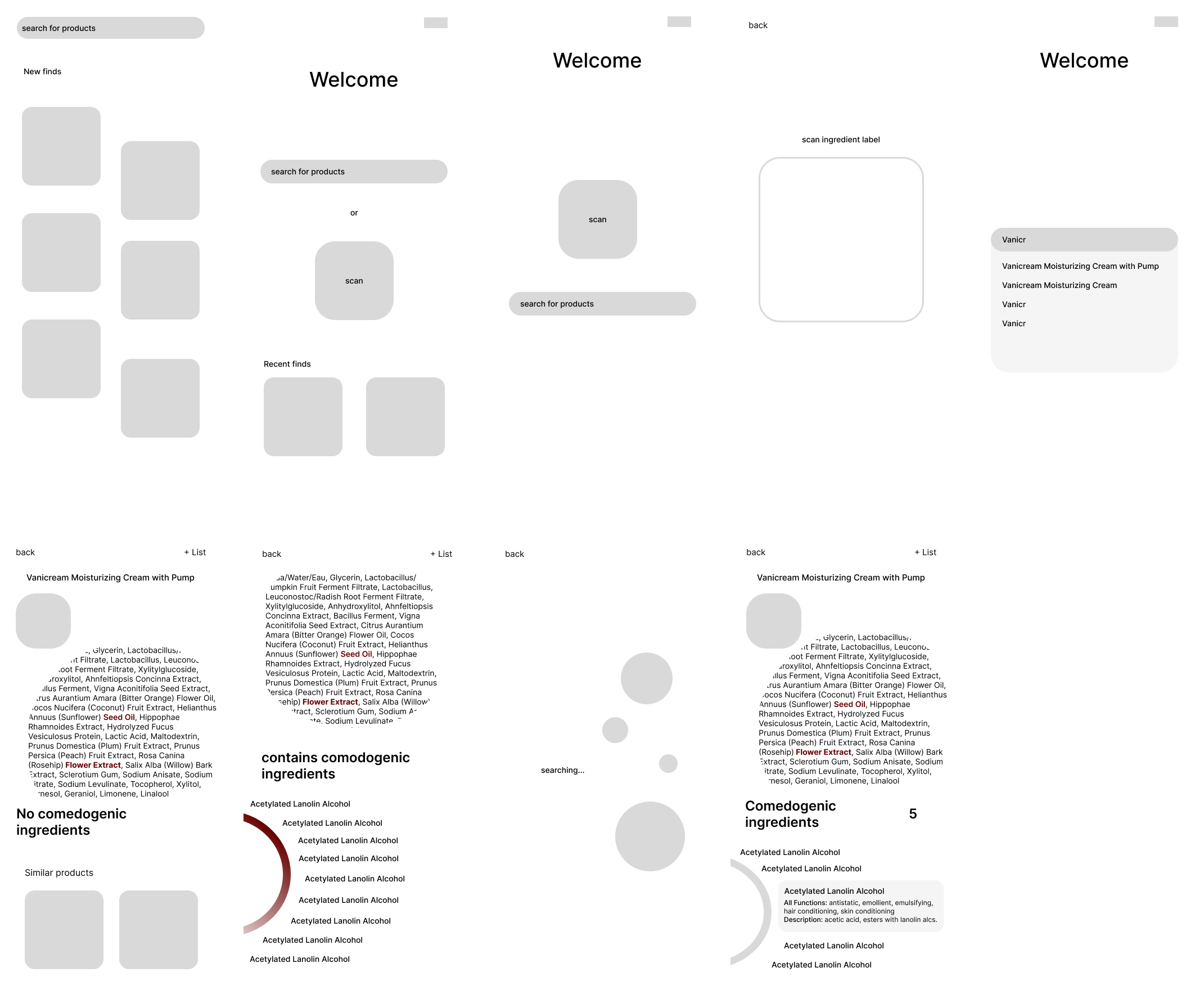
Lo Fi
Hi Fi
A note on accessibility
When designing, accessibility is not an afterthought but something that is inherently part of my design process. I follow WCAG guidelines and strive to continuously learn about best practices. I take into consideration things such as:
- font size and weight
- contrast and color
- sufficient padding for buttons
- clarity of copy
Amongst other things. My designs aren't perfect but I am dedicated to revising my designs and educating myself on how to create the most accessible and inclusive designs possible. If you see anything that looks really wrong please let me know!
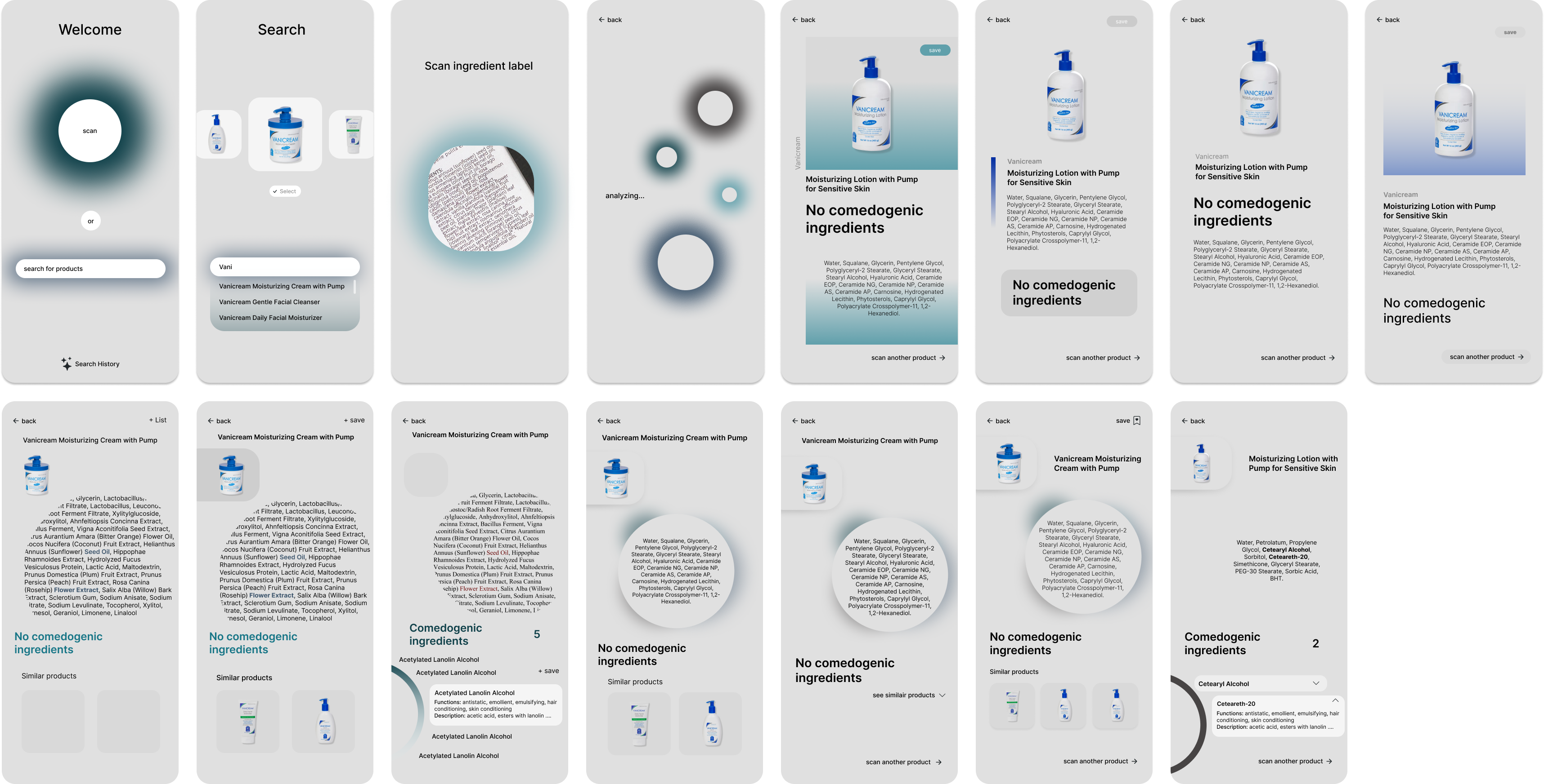
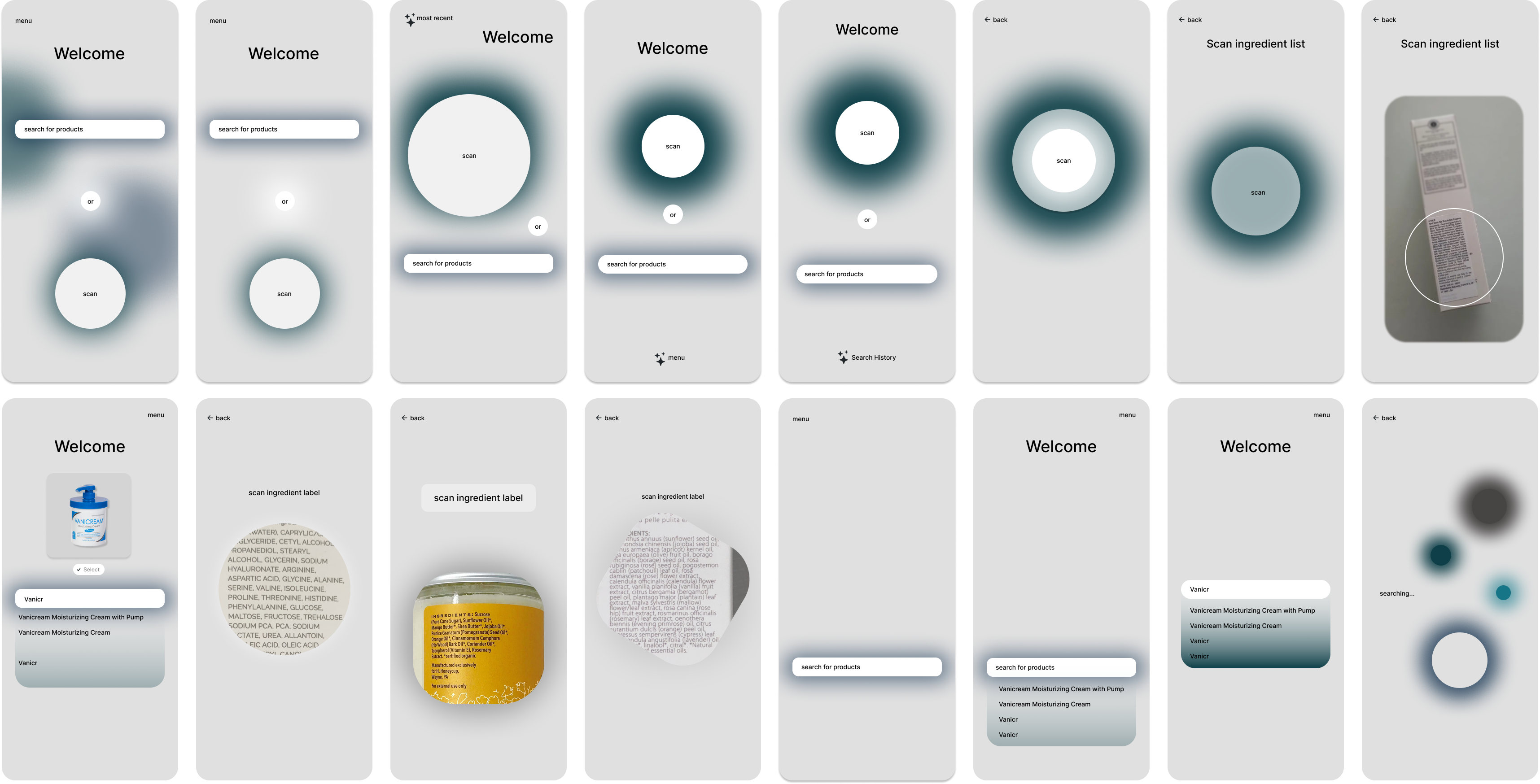
Welcome Screen

Search screen

Scanning screen

Loading screen motion design

Item page (non-comedogenic)

Item page (comedogenic)

Saved items screen

Next steps and reflection
Some key next steps would be to conduct user testing and interviews with real people to understand what they think of app. Additionally, I would be really interested in further exploring what features an app like this should have and what information people are interested I seeing regarding their personal care products.
I really enjoyed trying to do something different with the visual language of the UI and wanting to have it be as relaxing as possible. In retrospect I think I may have gone a little too crazy in that aspect and I don't know If I would try to be that different again but it was still a fun exercise in trying something different!